Before printing on fabric, you need to think and learn some things, otherwise you may be disappointed when you receive the finished product. In the future, almost everyone has a question: “Why was the picture the same on my device, but the colors on the product are not the same?”. So that such a question does not arise, everyone needs to know a few simple things about color transfer when printing on fabric.
What factors affect color transfer and what should be done so that the color of the finished print does not differ from the intended one? We will now answer these questions.
The main characteristics of high-quality printing on fabric are correct color rendering, high detail, clarity, natural smoothness of color transitions, absence of graininess, absence of “flaking” and the presence of “clearances” (transparent elements) in the print. The question of accurate color reproduction is probably the most frequently asked. Although his solution is quite simple.
Let’s understand what affects color rendering and why the color on the monitor screen may differ from the color on the fabric.
First, the monitor screen emits light, and the fabric reflects, that is, from the very beginning there is a difference in reading color information.
Secondly, each fabric takes paint in its own way – it all depends on the texture, weaving, composition, that is, the same shade of color printed on different fabrics will look different. Therefore, if you print the same print, but on different fabrics, it is necessary to make a color test for each. The texture and composition of the fabric greatly affect the color, so we recommend that you study the properties of the bases in advance and see samples of printing on our fabric in the Singleprint showroom at the address: str. Turivska, 4. We recommend printing on our fabrics, as these are selected fabrics and tested over the years, which we purchase steadily from manufacturers who adhere to the stated quality standards. Before deciding on our suppliers, there were many tests, including undesirable results, also on fabrics and finished products of customers (for example: due to fluffiness, the print does not lie evenly, or after exposure to a temperature of 160 C (when drying the product under a press ) synthetic thread is damaged, which leaves reddish-brown spots, they appear on average after 3-5 days).
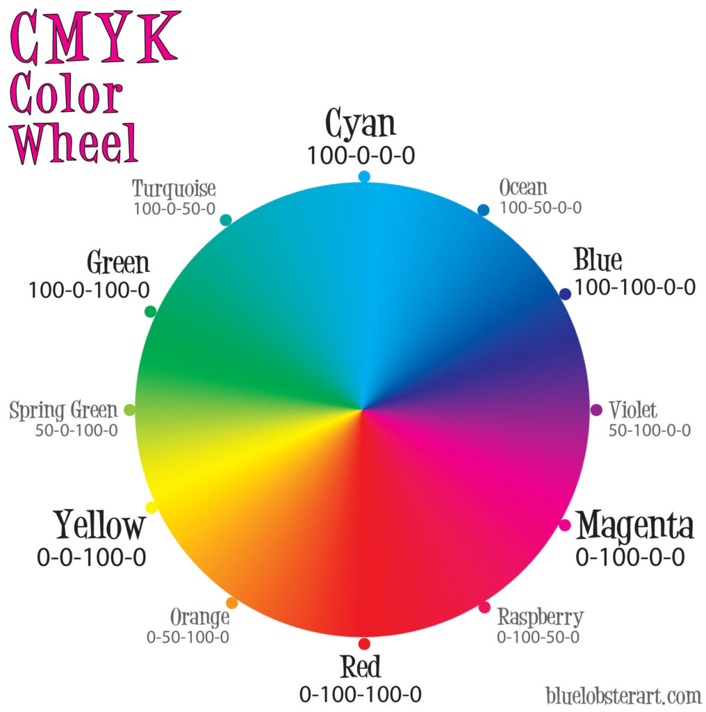
Third, RGB vs CMYK. Another reason may be that you focused on the RGB system, but on digital printers, color is “mixed” according to the CMYK model, in which different colors and shades are mixed from 4 basic colors (yellow, crimson, blue, black).
Fourth, saturation. Printing on a colored product takes place with the preliminary application of a white pigment – “substrate”, due to this, the print looks more saturated. As for printing on white types of products: a small percentage of the paint is absorbed into the structure of the fabric, subsequently the finished print will look less saturated.
It is worth mentioning that printing usually takes place in two approaches, for a more saturated shade and accurate rendering of colors according to the CMYK model. It is possible to print in one run, only in individual cases by agreement with the client. Below you can see an example of printing in one and two passes.
Fifth, the quality of the layout. It is also very important to properly prepare the layout for printing. It is quite possible that the color may “take off” when converting the file. This often happens when you do not follow the recommendations of pre-press layout preparation. We have selected several common mistakes when preparing a layout:
- extension less than 300 Pixels / Inch (Image> Image Size)
- excess area around the layouts is not trimmed (Image> Trim ..)
- for black and white layouts, use the Grayscale color scheme (Image > Made > Grayscale)
- the RGB scheme is used for color layouts. I would like to draw your attention to the fact that the layout must first be created using the CMYK color model, and not converted from RGB (later the layout will undergo a double conversion and the color loss will be greater)
- layers are not merged (Layers> Merge)
- the permissible channel of the file is 8 bits, if this requirement is violated – the image may be cloned during printing (Image> Made> 8 Bits / Channele)
- all used fonts must be converted into curves (Illustrator) or into smart objects (Photoshop).
- all unnecessary elements in the layout should be removed, including the background, if it is not required to be printed.
- to vector files we can include the formats – Ai, PDF (if it was created in an editor that supports vector graphics), SVG, EPS. I would like to draw your attention to the fact that all elements of the layout must first be created only in an editor that supports vector graphics, after opening a file that was saved in raster format (jpeg, png, tiff, etc.) in a program that supports vector graphics, the file in vector does not convert.
How to get the desired color on the fabric, despite all these factors?
The simplest and correct answer to the question is called a color test. The rule “always do a color test before starting a print run” should work as an axiom. Yes, the color test requires additional time and additional costs, which, by the way, are not large, compared to what we receive in the event that we are not satisfied with the result. But this is the only correct, competent and professional way. We can go through several options that are displayed on a small piece of fabric and then agree with you on the most successful result, which will later be on your finished product.
In any case, our team is always waiting for you at the address Turivska, 4, we are always ready to help and answer your questions, as well as to do everything so that your product gets into your hands in the form in which you imagined it.
And finally about “environmentalism”. It may be that you have already printed your layout in the same polygraphy and turned to us, and it turned out that the printing is different. What could be the reason? You have printed on different types of fabrics (sometimes the same supplier may change the “impregnation” or the cotton supplier). If the products are the same and from the same batch, it may be that a different printing method was used in another printing house. If the print was still direct digital and others had it brighter, then the reason is the ink and primer (which are not so ecological, we all know more chemistry – greater saturation). We use ecological inks and equipment from official Epson suppliers, these inks are also suitable for printing on children’s products.